


Matera
Brand & Web Design
Matera creates a new standard of property management: more responsive, more transparent and more human. We supported them in their rebranding process by focusing on their website redesign, to propel this vision further.
Matera is a PropTech Saas company that allows co-owners to manage their buildings themselves without the services of a professional property manager.
With this new brand identity they aim to pursue their growth and become a leader in property management throughout Europe.
Design: Brand Identity, Website, Brandbook

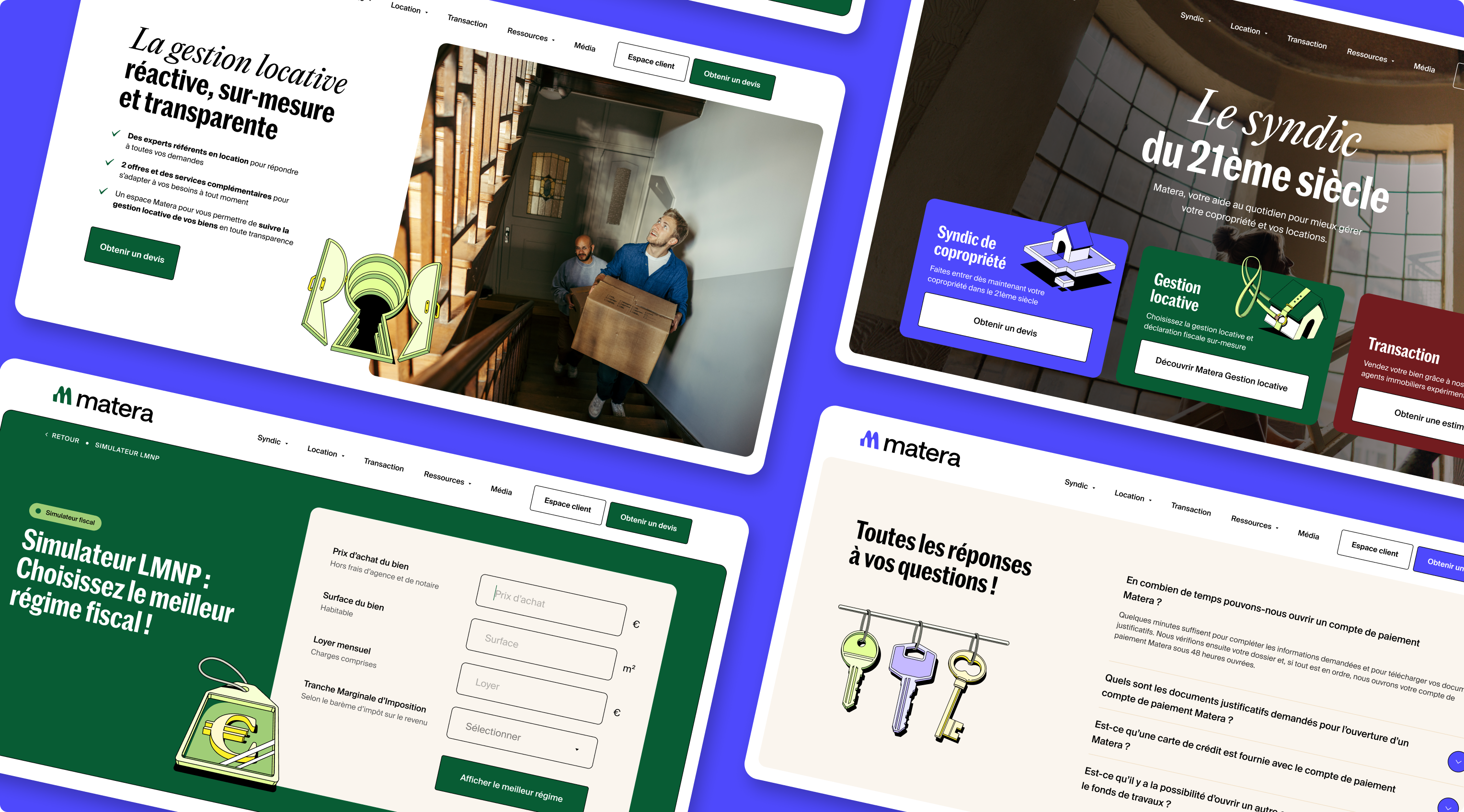
A new website raising awareness for their 3 verticals
This redesign aimed to professionalize the brand identity while showcasing the responsiveness and high quality of their service.
We worked on creating more distinction between products with associated brand colors (blue, green, red) while maintaining a strong visual connection with illustrations and font pairing, ensuring a smoother and more intuitive experience for users.


Old frustrations, new love affair.
One mission: Make co-owners happy in their building!
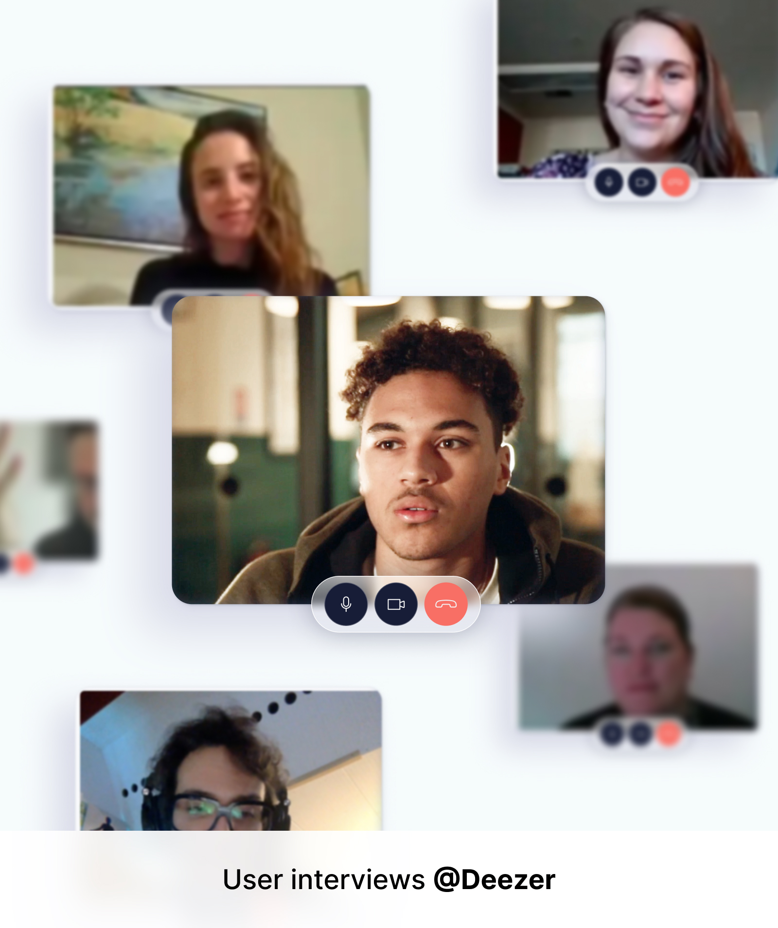
Matera aims to improve the daily life of all people who are mad at their property manager and the old (sometimes unfair) business practices. We chose to highlight this shift by emphasizing human-centric storytelling and visuals throughout the new branding.


The human touch to bring authenticity
Bringing a more human touch to strengthen trust and engagement across the platform was a key pillar of our brand strategy.
This resulted in the quest for highly realistic photos that we carefully selected and edited to reinforce this idea of authenticity.


An enthusiastic look to inspire change
Disrupting a market is hard, but doing it with the smile always feels better.
The website layout has been designed so it feels very smooth, light and pleasant for users to go through key informations before committing to try for the service.

The making of a strong visual brand
We worked closely with their brand & marketing teams to bring this amazing project to life.
Font-wise we played with the unusual pairing of Marr Sans Condensed & PP Editorial New to bring a sense of sophisticated yet friendly, accessible tone.
Color wise, the dominant Bleu Matera acts a the main brand color while the red and green share the front stage as accent colors associated to verticals.
- 1 month -
Redesign of 30+ pages website
Brandbook for international markets
1st actor for property management in France
65.7M€ in total funding
We thank the Matera team for trusting us with their rebranding and the complete redesign of their website.

Benjamin Lafaurie
Head of Design @ Matera
----------------
"Beyond the speed of execution we needed an outside perspective and people who could make strong and creative ideas, which you guys did extremely well! It was super enjoyable to work with The Design Crew and the result is stunning.
Huge thanks! "
Other projects


